


The graph below shows the demand for electricity in England during typical days in winter and summer. The pie chart shows how electricity is used in an average English home.
Summarise the information by selecting and reporting the main features, and make comparisons where relevant.
Overview
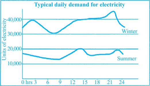
冬天的每日耗电量总体是夏天的两倍,对应②。无论是冬天还是夏天,用电量的低谷都在早上9点左右,而下午2点以及午夜则会达到高峰,对应③。
Main Features
(1)冬天在早上3点的时候,还出现了另外一个用电高峰,达到40 000个单位,对应④。
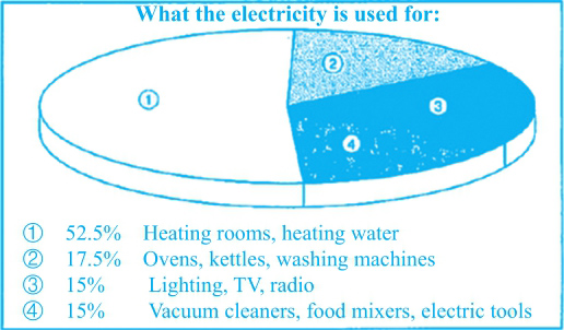
(2)在用电去处方面,heating rooms和heating water占的比例是最高的,对应⑥;其他几项基本持平,ovens, kettles and washing machines占17.5%,剩下的vacuum cleaners和food mixers等electric tools与lighting, TV, radio的数据相近,都占15%,对应⑦。
Relevant Comparison
在饼图中,Main Features的分析已经做了共同点和不同点的比较,且线形图的共同点也由Overview进行了描述。
NB: Please note that this is just one example out of many possible approaches.
①The graph compares the use of electricity in England during a day in winter with that in summer. ②It can be seen that the demand for electricity in a cold day varies between 30,000 units and approximately 45,000 units, about twice as much as that in a hot day. ③The trough appears at 9 a.m. while 2 p.m. and the midnight turn out to be the peak time in both of the two seasons. ④However, there is one more peak in winter, which is at 3 a.m., when the electricity use reaches 40,000.
⑤The pie chart provides information on how the electricity is used at home. ⑥As is shown in the chart, it is mostly used for heating rooms and heating water (52.5%), and that explains why it is more desired in winter. ⑦The proportions of electricity used for the other three purposes are almost even, 17.5% for ovens, kettles and washing machines, and 15% each for electric tools including vacuum cleaners and food mixers, and lighting, TV and radio.
(170 words)
The charts below give information about travel to and from the UK, and about the most popular countries for UK residents to visit.
Summarise the information by selecting and reporting the main features, and make comparisons where relevant.
Visits to and from the UK
Most popular countries visited by UK residents 1999
Overview
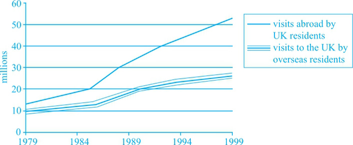
UK residents who travelled abroad始终多于visitors to the UK,且两者的差值在不断变大,对应②。
Main Features
(1)UK residents who travelled abroad的数据在1979年之后的9年里翻倍了,对应③;该数据随后加速增长,达到50 million,对应④。
(2)the visitors to the UK只有一个小幅上升,对应⑤。
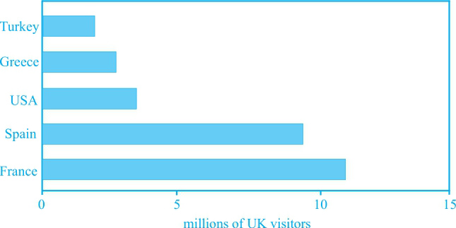
(3)在柱状图中,法国是英国游客的第一选择,随后是西班牙,对应⑧。
Relevant Comparison
(1)共同点:在柱状图里,土耳其、希腊和美国的数据相近,对应⑨。
(2)不同点:同UK residents who travelled abroad 相比,the visitors to the UK的增长是相对较小的,对应⑤;在1999年,the visitors to the UK的数据仍少于UK residents who travelled abroad,对应⑥。
NB: Please note that this is just one example out of many possible approaches.
①The graph gives information about the number of visitors to and from the UK during the period 1979 to 1999. ②It can be seen that UK residents who travelled abroad were more than visitors to that country throughout the given years, and the gap between them increased with time.
③Approximately 14 million UK residents travelled abroad in 1979, and this number doubled nine years later. ④After that, the growth accelerated, with the number soaring to slightly over 50 million in 1999. ⑤In contrast, the visitors to the UK had shown only a marginal rise by 1986, from 10 million to 11 million. ⑥Although the increase escalated since then, they were still about 25 million fewer than UK residents that travelled abroad in 1999.
⑦The bar chart illustrates the countries which UK residents travelled to in 1999. ⑧Among the five given countries, France was the most popular one, bearing about 11 million UK visitors in that year, followed by Spain (9 million). ⑨Turkey, Greece and the USA presented similar numbers, approximately 2 million, 3 million and 4 million, respectively.
(178 words)
The graph and table below give information about water use worldwide and water consumption in two different countries.
Summarise the information by selecting and reporting the main features, and make comparisons where relevant.
Global water use by sector

Water consumption in Brazil and Congo in 2000
Overview
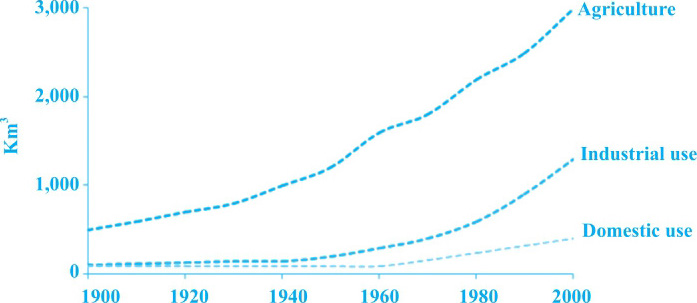
在20世纪全球用水方面,农业的用水量一直高于工业和家庭用水,对应②;在给定的两个国家中,有更多灌溉土地的国家用水量也更高,对应⑧。
Main Features
(1)在1900年,农业用水量在500 km 3 左右,而其他两项均非常小,对应③。
(2)在前50年里,三个数据总体呈现小幅上升趋势,对应④。
(3)巴西的人口和灌溉土地面积较刚果要大很多,对应⑥;巴西的人均用水量也要高很多,对应⑦。
Relevant Comparison
在静态图中,数据Main Features的呈现即为做共同点和不同点的比较。
难点分析:静态图注意倍数关系的比较。
NB: Please note that this is just one example out of many possible approaches.
①The graph shows the amount of water used for three different purposes, namely agriculture, industrial and domestic use worldwide during the period 1900 to 2000. ②It can be seen that agriculture had been the largest sector in terms of water use throughout the given period.
③About 500 km 3 of water was used for agriculture in 1900, while the use in the other two sectors was minimal. ④Then there was a marginal rise in all the three sectors during the first half century and a surge during the other half, rising to 3,000 km 3 in agriculture, 1,000 km 3 in industry and 300 km 3 for domestic use.
⑤The table indicates the water consumption in two countries in 2000. ⑥Brazil is the one with a larger population, 176 million compared with 5.2 million in the Democractic Republic of Congo, and more irrigated land (26,500 km 2 compared with 100 km 2 in Congo). ⑦Also, the water consumption per person there was much higher (359 km 3 compared with 8 km 3 in Congo).
⑧Overall, water is mostly used for agriculture during the last century, and the country with more irrigated land showed higher water consumption in 2000.
(190 words)
The pie chart below shows the main reasons why agricultural land becomes less productive. The table shows how these causes affected three regions of the world during the 1990s.
Summarise the information by selecting and reporting the main features, and make comparisons where relevant.
Causes of worldwide land degradation

Causes of land degradation by region
*A large group of islands in the South Pacific including Australia and New Zealand
Overview
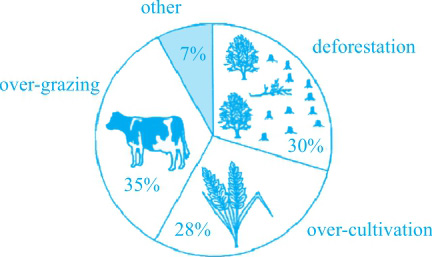
全球范围内土地退化的主要原因包括over-grazing, over-cultivation和deforestation;表格中给定的三个区域里面欧洲的土地退化情况最严重。对应②③。
Main Features
(1) deforestation是欧洲土地退化的最主要原因,而另两个地区因此造成退化的土地很少,对应④⑤。
(2) over-grazing在Oceania造成退化的土地比例是在Europe的两倍,对应⑦。
(3) Europe总的退化的土地比例几乎是Oceania的两倍、North America的五倍,对应⑧。
Relevant Comparison
表格中的数据可以分原因来写,比较三个不同的原因在三个地区造成退化的土地比例。
NB: Please note that this is just one example out of many possible approaches.
①The pie chart indicates the contributors to worldwide land degradation, and the table presents the proportion of land degraded by different factors in North America, Europe and Oceania.
②It can be seen from the pie chart that over-grazing, deforestation and over-cultivation were the leading reasons for land damage, contributing to respectively 35%, 30% and 28% of the total, while the other 7% was caused by reasons other than them.
③According to the table, Europe experienced more serious land damage than the other two given regions. ④Totally 23% of land was damaged there, which was mostly caused by deforestation (9.8%). ⑤In contrast, this factor was insignificant in North America (0.2%) and Oceania (1.7%). ⑥Over-cultivation led to 7.7% of land damage in Europe and 3.3% in North America, whereas no land was damaged by it in Oceania. ⑦Over-grazing was the dominating reason in this region, leading to 11.3% of land degradation there, doubling what it did in Europe (5.5%).
⑧Overall, the total proportion of the degraded land in Europe (23%) doubled that in Oceania (13%) and was five times as much as that in North America (5%).
(185 words)
The table below shows the numbers of visitors to Ashdown Museum during the year before and the year after it was refurbished. The charts show the result of surveys asking visitors how satisfied they were with their visit, during the same two periods.
Summarise the information by selecting and reporting the main features, and make comparisons where relevant.

Results of surveys of visitor satisfaction
Overview
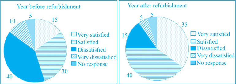
博物馆装修后,游客数量上升;游客对博物馆的满意度增加,对应②⑧。
Main Features
博物馆装修前,只有15%的人选择“很满意”,紧随其后的是选择“很不满意”的人,占10%。对应④。
Relevant Comparison
相同点:博物馆装修后选择“很满意”和“满意”的游客比例都有明显上升;而选择“很不满意”和“不满意”的游客比例都有所下降,对应⑤⑥⑦。
NB: Please note that this is just one example out of many possible approaches.
①The table provided compares the number of visitors to Ashdown Museum in both the years before and after the refurbishment, and its accompanying pies illustrate the results regarding the satisfaction level of visitors after visiting during the same two periods.
②It is clear from the table that the figure for museum visitors increased substantially from 74,000 to 92,000 after the redecoration, while the dissatisfactory impression towards the museum after visiting alleviated to a large extent due to the restoration.
③Prior to the refurbishment, “dissatisfied”turned out to be the most likely option for visitors’feedback accounting for 40% while 10% less people tended to be satisfied with it. ④Surprisingly, there were only 15% of people who chose to vote “very satisfied”, closely followed by 10% of “very dissatisfied”visitors, and 5% of visitors did not respond to the survey for some reason.
⑤However, the survey outcome changed dramatically after the museum was being redecorated with more satisfaction response in general. ⑥The proportion of “very satisfied”and “satisfied”rose to 35% (an over two times rise) and 40% respectively. ⑦By contrast, the dissatisfaction situation lessened with 15% of “dissatisfied”and 5% of “very dissatisfied”, and the “No response”figure remained unchanged.
⑧Overall, it is worth noting that the number of visitors and the satisfaction level all increased after the refurbishment of the museum.
(222 words)
The graph and table below show the average monthly temperatures and the average number of hours of sunshine per year in three major cities.
Summarise the information by selecting and reporting the main features, and make comparisons where relevant.


Total annual hours of sunshine for London, New York and Sydney
Overview
(1)Sydney在1—4月及10—12月都是最热的城市,5—9月间最冷,对应②。
(2)三城12月的温度情况均与年初极为相近,对应③。
Main Features
(1)气温变化:London和New York均为先升后降趋势,并且最高点出现在7月,对应④和⑤;Sydney呈现先降后升趋势,最低点出现在6月中旬,对应⑥⑦⑧。
(2)日照时间:New York和Sydney对比接近,对应⑩;London最短,对应⑪。
Relevant Comparison
(1)共同点:London和New York的气温变化趋势;年初与年末气温排位情况;New York和Sydney的日照时间长度。
(2)不同点:London及New York的气温变化趋势有别于Sydney。
(3)对象之间数据大小的比较:一年中三个时间段最冷和最热的城市不同;New York和Sydney的日照时间是London的约两倍。
难点分析:在三城气温变化线形图中,除各自的变化趋势外,还需要完成对三个不同时间段的各个城市之间的气温的对比。
NB: Please note that this is just one example out of many possible approaches.
①The line graph gives an overview of how temperatures in London, New York and Sydney vary throughout a year. ②From it, we can see that Sydney is constantly the hottest in the first and the last quarter with more or less than 25 degrees while it turns out to be the coldest from May to early September, during which time period New York is the warmest, closely followed by London. ③Noticeably, however the temperatures change, those in December show great resemblance to the beginning.
④As to the city of London, after a moderate increase of about 15 degrees to its highest at slightly under 25 degrees in July, the next five months see a rapid decline to 10 degrees. ⑤Similarly, increasing sharply to reach 30 degrees in July, the temperature of New York City has a considerable drop to 5 degrees by the end of the year. ⑥The temperature in Sydney shows an opposite case. ⑦It changes little from January to March, from which month onwards, it falls greatly to its lowest at a little over 15 degrees in mid-June. ⑧However, it recovers gradually in December, hitting 25 degrees again.
⑨The table shows how long the sun shines annually on average in the three cities. ⑩The total hours of yearly sunshine in New York are quite close to those in Sydney, both of which reach 2,500 hours or so. ⑪Comparatively, London gets the shortest time period of sunshine, below a half of two of its counterparts.
(246 words)