
下载掌阅APP,畅读海量书库
立即打开


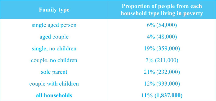
The table below shows the proportion of different categories of families living in poverty in Australia in 1999.
Summarise the information by selecting and reporting the main features, and make comparisons where relevant.
Overview
澳大利亚总的贫困人口比例是11%,人数为1 837 000,对应②;single families(with or without children)的贫困率比其他家庭结构的都高,对应③。
Main Features
在家庭贫困率方面,couples with children的贫困率比couples without children要高,前者几乎是后者的两倍(12%;7%),对应⑤;贫困率最低的家庭模式是两组老年家庭,对应⑥;在贫困人数方面,couple with children是最多的,其次是single families without children,对应⑦⑧。
Relevant Comparison
(1)共同点:couple without children和sole parent families贫困人数是相似的,对应⑨。
(2)不同点:single parent的贫困率要比single without children的高2%,对应④;与single families相比,families with couples(with or without children)的贫困率都要低不少,对应⑤。
难点分析:各类家庭贫困比例的排序和贫困人口数量的排序是不同的。
NB: Please note that this is just one example out of many possible approaches.
①The table indicates the percentages of people living in poverty from different types of families in Australia in 1999. ②It can be seen that the number of impoverished people in total was 1,837,000, occupying 11% of the Australian population.
③The single families, with or without children, showed more serious poverty than the other types. ④21% of people from the former families were impoverished, 2% more than those from the latter. ⑤Compared with them, families with couples, with or without children, presented much smaller percentages of poverty, and it is worth mentioning that in those two types of families, those with children also showed a larger proportion (12%), almost twice as much as those without children did (7%). ⑥The best financial status appeared in the two family types with aged people, either single or couple, with respectively 6% and 4% of people living in poverty.
⑦Apart from the proportions, the table also illustrates the number of impoverished people from those families. ⑧In this respect, couple with children topped the others (933,000), followed by single families without children (359,000). ⑨Couple without children and sole parent families were similar, 211,000 and 232,000, respectively, and two types of aged families showed relatively small numbers, around 50,000.
(202 words)
The chart below shows the different levels of post-school qualifications in Australia and the proportion of men and women who held them in 1999.
Summarise the information by selecting and reporting the main features, and make comparisons where relevant.
Post-school qualifications in Australia according to gender 1999
Overview
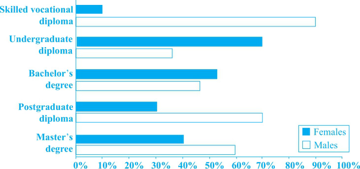
男性在持有skilled vocational diploma, postgraduate diploma以及Master’s degree方面比例较高,而女性在持有undergraduate diploma以及Bachelor’s degree方面比例较高,对应②;男女比例差距最大的在skilled vocational diploma的持有者中,而最小的在Bachelor’s degree的持有者中,对应⑤。
Main Features
(1)skilled vocational diploma持有者的男女比例差距是最大的(90%∶10%),而postgraduate diploma和undergraduate diploma持有者的男女比例差距分别是40%和30%,对应③。
(2)在Bachelor’s degree和Master’s degree持有者中男女比例差距相对较小,对应④。
Relevant Comparison
在Overview和Main Features中已经对数据的共同点和不同点做了分析,对应②③;而Main Features里面也对相关的数据做了大小比较,对应④。
NB: Please note that this is just one example out of many possible approaches.
①The bar chart illustrates the proportions of males and females holding different post-school qualifications in Australia in 1999. ②It can be seen that males were dominant among skilled vocational diploma, postgraduate diploma and Master’s degree holders, while females prevailed in terms of undergraduate diploma and Bachelor’s degree.
③The most obvious gap between people of the two genders was in skilled vocational diploma, with 90% of the holders being males and 10% females, followed by postgraduate diploma and undergraduate diploma, which showed 40% and 30% difference between the two genders, respectively. ④In contrast, the proportions of males and females were relatively close in both the Bachelor’s and Master’s degrees, with 55% of the former and 40% of the latter holders being females, and respectively 45% and 60% being males.
⑤Overall, the lowest post-school qualification showed the largest difference between men and women, while the smallest difference was in the Bachelor’s degree.
(150 words)
The charts below show the main reasons for study among students of different age groups and the amount of support they received from employers.
Summarise the information by selecting and reporting the main features, and make comparisons where relevant.
Reasons for study according to age of student
Employer support, by age group (Time off and help with fees)
Overview
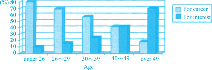
第一个柱状图里,年龄越大的人越倾向于为兴趣而不是为职业发展学习,对应②;第二个柱状图里,雇主更倾向于支持年轻人,对应⑦。
Main Features
(1)第一个柱状图里,26岁以下的人里面,绝大多数为职业发展而学习(80%),对应③。
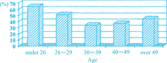
(2)第二个柱状图里,30~39岁的人是最不受雇主支持的,对应⑧。
Relevant Comparison
(1)共同点:第一个柱状图里,40~49岁的人中,为工作和兴趣而学习的比例相同,对应⑤。
(2)不同点:第一个柱状图里,在年龄最大的一组(49岁以上)中,为工作而学习的只占19%,为兴趣学习的占70%,对应④。
NB: Please note that this is just one example out of many possible approaches.
①The first bar chart provides information on the percentage of people in different age groups who learn for career or interest. ②It can be seen that for the older people, the lower proportion they choose to learn for career, the higher the proportion is for interest.
③The vast majority of people under 26 (80%) choose to learn for career, while only 10% of them make the other choice. ④By contrast, in the eldest age group (over 49), those who study for work only occupy 19%, whereas 70% learn for interest. ⑤It is also noticeable that people making the two choices tend to be even in the age group of 40-49, constituting slightly over 40% each.
⑥The second bar chart indicates the proportion of employees who receive support from their employers. ⑦It is clear that the support tend to favour the younger age groups, with 61% of employees under 26 and 50% of those aged 26-29 receiving it. ⑧30-39 is the least favoured group (30%), and the two elder groups are not much better than it.
(175 words)
The table below gives information about the underground railway systems in six cities.
Summarise the information by selecting and reporting the main features, and make comparisons where relevant.
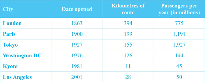
Underground Railway Systems
Overview
越早建成的地铁,其里程数越长,对应②;伦敦拥有历史最悠久且里程数最长的地铁,而东京地铁的年均载客量是最多的,对应⑨。
Main Features
(1)巴黎和东京的地铁里程数和伦敦相比,前者略高于伦敦的一半,后者则不足伦敦的一半,对应④。
(2)京都地铁的里程数为11km,而年均载客量仅有4 500万人,对应⑦。
Relevant Comparison
(1)共同点:无。
(2)不同点:伦敦地铁的历史比其他几个城市都悠久,对应③;巴黎和东京地铁的年均载客量要远高于伦敦,对应⑤;相较于东京,京都的地铁开通得比较晚,对应⑥;华盛顿的地铁开通时间早于洛杉矶的地铁,且里程数是其4倍,年均载客量是其3倍,对应⑧。
难点分析:静态图注意倍数关系的比较。
NB: Please note that this is just one example out of many possible approaches.
①The table gives information about the railway systems in six cities, including the opening date, the length of route and the passengers per year.
②It can be seen that generally, the earlier a city started the railway system, the longer route it now has. ③London opened the railway system earlier than all the other cities, and now 394 kilometres have been completed, carrying 775 million passengers every year. ④Paris and Tokyo started 37 and 64 years later, respectively, with the length of route of the former slightly over half, and the latter less than half of that in London. ⑤However, the number of passengers in those cities was much larger, 1,191 million per year in Paris and 1,927 million in Tokyo.
⑥In contrast to Tokyo, another Japanese city, Kyoto opened the railway quite late (1981). ⑦It now stretches for 11 kilometres, with only 45 million passengers every year.
⑧As for the two American cities, Washington DC started the train system earlier (1976) than Los Angeles (2001), the route being four times as long (126 and 28 kilometres respectively) and passengers three times as many (144 and 50 million respectively).
⑨Overall, London started railway the earliest, and enjoys the longest route, while Tokyo has the largest number of passengers.
(208 words)
The table below gives information on consumer spending on different items in five different countries in 2002.
Summarise the information by selecting and reporting the main features, and make comparisons where relevant.
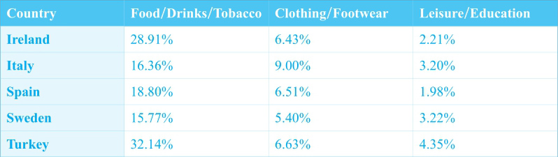
Percentage of national consumer expenditure by category—2002
Overview
food/drinks/tobacco在几个项目中占比最大;土耳其在几个国家中占比最大,对应⑪。
Main Features
(1)在food/drinks/tobacco这一项中,土耳其占比最大,爱尔兰次之,对应②③。
(2)在clothing/footwear这一项中,意大利占比最大,几乎是瑞典的两倍。另外三个国家比重基本相当。对应⑤⑥⑦。
(3)在leisure/education这一项中,土耳其占比最大,几乎是爱尔兰和西班牙的两倍。另外两个国家比重几乎一样。对应⑧⑨⑩。
Relevant Comparison
此图给出了三个不同的项目,可以此将图中数据分为三组,分别进行数据比较。
NB: Please note that this is just one example out of many possible approaches.
①The table indicates the proportion of national consumer expense on three different items in five European countries in 2002.
②As the most money-consuming item, food/drinks/tobacco took up 32.14% of the total national consumer expenditure in Turkey. ③Ireland followed, the figure being slightly smaller (28.91%). ④The other three countries (Italy, Spain and Sweden) were less bothered by food, the figures for which were all below 19% (16.36%, 18.80% and 15.77%, respectively).
⑤Clothing/footwear consumed less money than food in those countries. ⑥It accounted for 9.00% in Italy, the country that prevails in this column, almost doubling the figure for Sweden (5.40%). ⑦Turkey was similar to Ireland and Spain in this item, all around 6.50%.
⑧The other item in question was leisure/education, which was the least demanding for money. ⑨Turkey once again exceeded the other countries, with the proportion on this item (4.35%) twice as much as that for Ireland (2.21%) and Spain (1.98%). ⑩Italy and Sweden were almost identical (3.20% and 3.22%, respectively).
⑪To conclude, food/drinks/tobacco constituted the largest proportion of national consumer expenditure in all the given countries, among which Turkey excelled with the total percentage of expense on all the three given items.
(193 words)
The first chart below shows how energy is used in an average Australian household. The second chart shows the greenhouse gas emissions which result from this energy use.
Summarise the information by selecting and reporting the main features, and make comparisons where relevant.
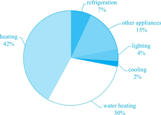
Australian household energy use
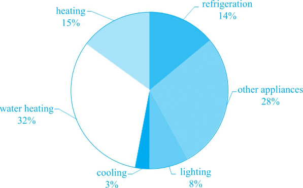
Australian household greenhouse gas emissions
Overview
water heating占据了第二大能源消耗的地位,并且在温室气体排放方面占比最高,对应⑩。
Main Features
(1)第一张饼图里,heating 和water heating能源消耗最大,对应②;refrigeration, lighting和cooling的能源消耗占比均小于10%,cooling占比最小,对应③。
(2)第二张饼图里,water heating的温室气体排放占比最大(占到了1/3),对应⑤;heating和refrigeration的排放值占比接近,对应⑥;排放整体排序,对应⑤⑥⑦⑧⑨。
Relevant Comparison
在这组静态图中,数据Main Features的呈现即为做共同点和不同点的比较。并且,两张图中的共同点也由Overview进行了描述。
NB: Please note that this is just one example out of many possible approaches.
①The two pies show the information about the distribution of household energy use and relevant greenhouse gas emission in Australia.
②From the first pie, we can see that the major consumers of domestic energy are heating and water heating, accounting for 42% and 30% respectively. ③Energy used for refrigeration, lighting and cooling make up less than one-tenth for each, with cooling consuming the least of only 2%. ④Another 15% of energy use goes to other appliances.
⑤It can be seen from the second pie that no items emit greater amount of greenhouse gas than water heating does—nearly one-third. ⑥Followed by that are heating and refrigeration, both of which produce the roughly same amount of gas emission at the level of 15%. ⑦Next comes lighting with 8%. ⑧3% of greenhouse gas is emitted by cooling, taking the last place of all. ⑨The remaining 28% is generated from other appliances.
⑩All in all, water heating consumes the second largest share of energy while its domestic greenhouse gas emission is also the most noticeable.
(172 words)
The charts below show what UK graduate and postgraduate students who did not go into full-time work did after leaving college in 2008.
Summarise the information by selecting and reporting the main features, and make comparisons where relevant.
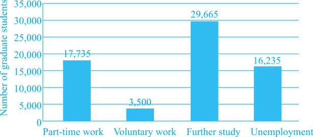
Destination of UK graduates (excluding full-time work) 2008
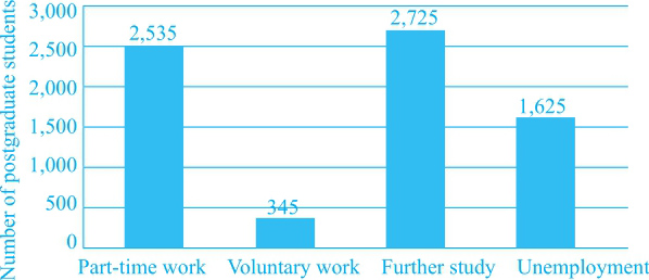
Destination of UK postgraduates (excluding full-time work) 2008
Overview
(1)整体来说,继续学业是最多人的选择,做兼职的人数紧随其后,对应②。
(2)本科毕业生的失业人数是硕士毕业生的10倍,对应⑧。
Main Features
(1)两组人群中的失业人群占比较大,人数略低于做兼职的人数,对应③。
(2)本科毕业生:选择继续学习的人很多,是选择兼职人数的两倍,对应④⑤。
(3)硕士毕业生:选择深造和选择兼职的人数相似,选择做志愿者的人数很少,只占前两类人数的1/7,对应⑥⑦。
Relevant Comparison
在这组静态图中,数据Main Features的呈现即为做共同点和不同点的比较。并且,两张图中的共同点也由Overview进行了描述。
难点分析:静态图注意倍数关系的比较。
NB: Please note that this is just one example out of many possible approaches.
①The charts give information about the destination of UK graduates and postgraduates who did not choose to work full-time after leaving university in 2008. ②Overall, it is clear that to further their study was the No. 1 option, followed by taking on part-time work. ③Noticeably, both of the two groups of young people who did not choose any kind of work made up a fairly large part, second to those part-timers, with over 15,000 and 1,500 for each group, respectively.
④To be more specific, around 30,000 graduate students decided to study for a higher degree or other academic qualifications. ⑤This figure doubled those who worked part-time in that year. ⑥Comparatively speaking, the number of postgraduate students who went on studying (2,725) showed a great resemblance to that of working part-time (2,535), though the former was slightly more than the latter. ⑦Only 345 of them chose to work without being paid, approximately one-seventh of the above two groups.
⑧It can be seen from the graph that the total number of graduate students was ten times as much as the postgraduate ones.
(179 words)
The charts below show the percentage of water used for different purposes in six areas of the world.
Summarise the information by selecting and reporting the main features, and make comparisons where relevant.
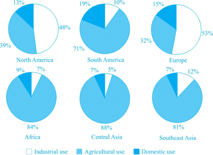
Percentage of water used for different purposes in six areas of the world
Overview
北美和欧洲工业用水最多,而其他四个地区农业用水最多。对应②。
Main Features
(1)北美和欧洲:工业用水最多,其次是农业,占最小比例的是生活用水。对应③④。
(2)非洲、中亚和东南亚:农业用水占了绝大部分(the vast majority),而另两类用水所占比例相似。对应⑤。
(3)另一个农业用水占比最大的地区是南美,其生活用水相对其他地区占比较大。对应⑥⑦。
Relevant Comparison
每个地区的农业、工业和生活用水所占不同比例分别进行比较。此外,不同地区之间也有比较,如南美生活用水相对其他地区占比较大。对应⑦。
NB: Please note that this is just one example out of many possible approaches.
①The pie charts indicate the different proportion of water used for three purposes in six regions. ②It can be seen that North America and Europe have the largest proportion of water used for industry, while the other four regions see agriculture contributing to the majority of water consumption.
③About half of the total water is used by industry in North America and Europe (48% and 53%, respectively). ④The following sector is farming, which constitutes respectively 39% and 32% in those two regions, and domestic use occupies the remaining 13% and 15%.
⑤Water used in agriculture takes up the vast majority of the total in Africa, Central Asia and Southeast Asia (84%, 88% and 81%, respectively), and there is not much difference in that used in the other two sectors.
⑥Another region where agriculture is the largest water-consuming sector is South America, contributing to 71% of the total water use. ⑦Not only does this region feature that, but also it is the only area in question where domestic use far exceeds industry, consuming 19% of the total water.
(177 words)