


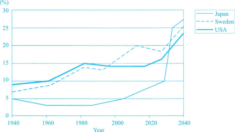
The graph below shows the proportion of the population aged 65 and over between 1940 and 2040 in three different countries.
Summarise the information by selecting and reporting the main features, and make comparisons where relevant.
Proportion of population aged 65 and over
Overview
1995年之前,美国的老龄人口占比是最高的,而到2040年,日本的老龄人口比例预计将达到最高,对应②。三个国家最开始和最终的数据都很接近,其间差距逐步扩大,对应⑦。
Main Features
(1)从1940年到1995年,美国和瑞典的数据均有大幅增长,对应③。
(2)日本的老龄人口比例先略有下降,1960年之后的20年中均保持平稳,对应④。
(3)1995年之后,瑞典和日本的数据均呈现上升态势,美国的则保持稳定,对应⑤。
Relevant Comparison
(1)共同点:最后的10年中,三个国家的老龄人口比例都大幅上升,对应⑥。
(2)不同点:从1940年到1980年,日本的变化趋势和美国及瑞典的截然相反,对应④。
NB: Please note that this is just one example out of many possible approaches.
①The graph provides information on the percentage of people aged 65 and above in three countries, namely Japan, Sweden and the USA during the period 1940 to 2040. ②It can be seen that the USA had the highest proportion of aged population before 1995, overtaken by Sweden from that year to 2040, when Japan is predicted to prevail.
③The first five decades and a half witnessed a sharp increase in both the USA and Sweden, where the proportion of aged population started from 9% and 7% respectively, and reached the same level of slightly below 15% in 1995. ④By contrast, Japan presented a different trend, declining from 5% to 3% in 1960 and stabilised for more than two decades since then.
⑤After 1995, while the Sweden and Japan is estimated to rise to 18% and 10% respectively by 2030, the figures for USA will remain steady at around 15%. ⑥However, the last decade will see a surge in all the three countries, to 26% in Japan, 25% in Sweden and 24% in the USA.
⑦Overall, the proportion of elder people in the three countries was close at both the beginning and the final years, whereas the gap widened in years in between them.
(203 words)
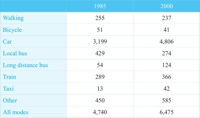
The table below gives information about changes in modes of travel in England between 1985 and 2000.
Summarise the information by selecting and reporting the main features, and make comparisons where relevant.
Average distance in miles travelled per person per year, by mode of travel
Overview
英国人均每年旅行的总里程数从1985年到2000年有所上升,且主要是因为机动车(除了公交车以外)的使用增多,对应②。
Main Features
(1)汽车在这两个年份里面都是最受欢迎的。在1985年,公交车的数据仅次于汽车,是火车的1.5倍,对应③④。
(2)在2000年,火车的数据增长了而公交车的数据却减少了,对应⑤。
(3)长途汽车和出租车的数据虽小,但是增幅很明显,对应⑥。
(4)自行车和走路的数据相对较稳定,只是各有一个小幅的下降,对应⑦。
(5)除上述交通方式之外,其他交通方式的总体数据也有所增长,对应⑧。
Relevant Comparison
在这个静态图中,数据Main Features的呈现即为做共同点和不同点的比较。
难点分析:静态图注意倍数和大小关系的比较。
NB: Please note that this is just one example out of many possible approaches.
①The table indicates the distance travelled on foot and by different modes of transportations in 1985 and 2000. ②As can be seen from the table, the total distance travelled by all modes increased from 4,740 miles to 6,475 miles during the two years, which could be attributed to the rise in the motor vehicles except local bus, as well as other vehicles.
③Among all the motor vehicles, car was the most popular one in both of the two given years, with the distance rising from 3,199 to 4,806 miles, occupying the vast majority of the total. ④Second to car, local bus travelled 429 miles in 1985, 50% more than train did. ⑤However, while train grew to 366 miles in 2000, local bus shortened to 274 miles. ⑥The length travelled by long distance bus and taxi was much shorter, yet the rise was noticeable.
⑦Both bicycle and walking were relatively stable, with a slight drop in the distance from 51 miles to 41 miles, and 255 miles to 237 miles, respectively.
⑧As for other transportations, they travelled 450 miles in 1985 and 585 miles in 2000 totally.
(186 words)
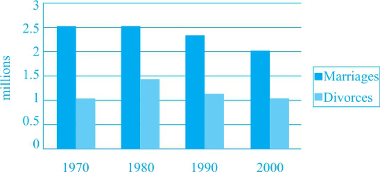
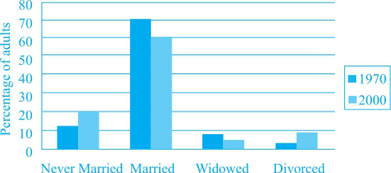
The charts below give information about USA marriage and divorce rates between 1970 and 2000, and the marital status of adult Americans in two of the years.
Summarise the information by selecting and reporting the main features, and make comparisons where relevant.
Number of marriages and divorces in the USA, 1970—2000
Marital status of adult Americans, 1970 and 2000
Overview
marriage数量在给定的时间里逐渐减少,其比例也呈下降趋势。相对地,divorce虽然数量相对稳定,但比例却呈上升趋势。对应⑨⑩。
Main Features
(1)第一个柱状图里,marriage数量先稳定再下降,对应③;divorce数量先升再降至一开始的数值,对应④。
(2)第二个柱状图里,已婚成人比例下降,而未婚成人比例上升。对应⑤⑥。
Relevant Comparison
题中两幅柱状图分别呈现了一些比较关系。除此之外两幅柱状图之间也有比较意义,表现在marriage和divorce的数量和比例之间的关系。对应⑨⑩。
NB: Please note that this is just one example out of many possible approaches.
①The two bar charts indicate the number of marriages and divorces in the USA and the percentage of adults in four different marital status from 1970 to 2000.
②According to the first chart, there were 2.5 million of marriages in 1970. ③This number stabilised for one decade, yet declined afterwards to 2 million in 2000. ④As for the number of divorces, it was about half of marriages in each of the given years, rising from 1 million to 1.4 million in the first decade, and dropping back to 1 million in the final year.
⑤The second chart indicates that although the majority of the adult Americans were married in both 1970 and 2000, the rate had fallen from 70% to 60%. ⑥In contrast, the percentage of adults who had never married by 2000 showed a rise from 12% to 20%. ⑦In terms of the widowed and divorced adults, the proportion remained below 10% in both years. ⑧Despite the small proportion, divorce rate presented a remarkable growth, from 2% to 9%.
⑨Overall, as the number of marriages declined during the three decades, the proportion of married adults also shrank. ⑩Meanwhile, divorces being relatively stable in number, their rate presented an obvious rise.
(201 words)
The graph below shows the consumption of fish and some different kinds of meat in a European country between 1979 and 2004.
Summarise the information by selecting and reporting the main features, and make comparisons where relevant.
Fish and meat consumption
Overview
除了鸡肉的销量上升,其他肉类的销量都下降。对应⑩。
Main Features
(1)牛肉和羊肉的销量都大幅下降。牛肉在1984年左右到达销量顶峰。对应②④⑤。
(2)鸡肉销量大幅上升。对应⑥。
(3)鱼肉销量相对稳定。对应⑨。
Relevant Comparison
(1)共同点和不同点:牛羊肉销量下降,而鸡肉销量上升;鱼肉销量相对稳定。对应②⑥⑨。
(2)对象之间数据大小的比较:2004年鸡肉销量几乎是牛肉的两倍。对应⑧。
NB: Please note that this is just one example out of many possible approaches.
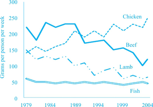
①The graph provides information on the demand for chicken, beef, lamb and fish in a European country during the period 1979 to 2004.
②The downward trend was marked in the consumption of beef and lamb. ③The former had been the most popular food by 1989. ④It started from about 220 grams per person per week in 1979, peaked at nearly 250 in around 1984, and fell dramatically to about 100 in 2004. ⑤Meanwhile, there has been a continuous drop in the latter, from 150 to slightly over 50 grams per person per week.
⑥Chicken consumption showed the opposite trend. ⑦It started from a relatively low level (about 140 grams per person per week) in 1979. ⑧Then after exceeding lamb consumption soon after that, and beef in around 1989, chicken became the most popular food, and had doubled beef consumption by 2004.
⑨As for fish, it presented a relatively stable trend, dropping slightly from about 60 to about 40 grams per person per week over the given period.
⑩Overall, almost all the food showed a decline in their consumption except chicken, which experienced a significant increase.
(185 words)
The chart below shows information about changes in average house prices in five different cities between 1990 and 2002 compared with the average house prices in 1989.
Summarise the information by selecting and reporting the main features, and make comparisons where relevant.
Percentage change in average house prices in five cities 1990—2002 compared with 1989
Overview
相对于1989年,大部分城市的房价在1990—1995年期间下降,而在1996—2002年期间上升,对应⑧。
Main Features
(1)1990—1995年期间,三个城市的房价相对于1989年大幅下跌,另两个城市小幅上升,对应②③。
(2)1996—2002年期间,伦敦房价涨幅最大,纽约次之,对应④⑤。
(3)1996—2002年期间,马德里房价涨幅是之前五年的两倍,对应⑥。
Relevant Comparison
此图显示的数据是1990年到2002年的房价相对于1989年的上升或下降比例,比较特殊。对此图的描述除了要写清楚相对于1989年上升、下降的幅度之外,给定的两个时间区间之间的比较也须提及:
(1)马德里后五年的增幅是前五年的两倍,对应⑥。
(2)东京的降幅和法兰克福的增幅都有所下降,对应⑦。
NB: Please note that this is just one example out of many possible approaches.
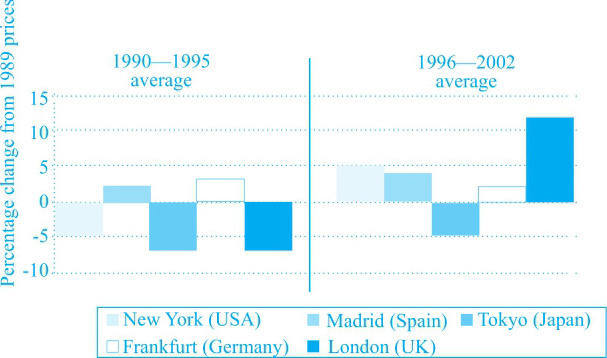
①The bar chart indicates the change in house price from 1990 to 2002 compared with that in 1989 in five different cities.
②According to the chart, the house price showed a marked decline during the first five years in three of the five given cities, by 5% in New York, and about 7% in Tokyo and London. ③The other two cities witnessed a slight rise, Madrid by 2% and Frankfurt by 3%.
④However, the following five years saw a considerable increase in most of the cities, among which London took the lead, with its house price 12% higher than that in 1989. ⑤New York followed, rising by 5%. ⑥Madrid continued with the upward trend, which doubled the increase during the previous period. ⑦As for the other two cities, the decline narrowed to 5% in Tokyo, while the increase shrank to 2% in Frankfort.
⑧Overall, 1990—1995 saw a general decline in house price compared with 1989, while 1996—2002 witnessed the opposite trend.
(161 words)
The pie charts below show units of electricity production by fuel source in France and Australia in 1980 and 2000.
Summarise the information by selecting and reporting the main features, and make comparisons where relevant.
Units of electricity by fuel source in Australia
Overview
两个国家的总发电量都上升。澳大利亚最重要的发电燃料是煤炭,而法国最重要的发电形式是核能,对应⑨。
Main Features
(1)在澳大利亚,用来发电的能源有coal, oil, natural gas 和hydro power。其中coal和hydro power的发电量在给定的时间里上升,而另两种燃料的发电量下降,对应②③④⑤。
(2)在法国,nuclear power的发电量在1980年次于coal、natural gas和oil,但到2000年一跃成为最重要的发电能源,对应⑥⑦。
Relevant Comparison
共同点和不同点:在澳大利亚,coal和hydro power的发电量都上升,对应③④;而oil和natural gas的发电量都下降,对应⑤。
NB: Please note that this is just one example out of many possible approaches.
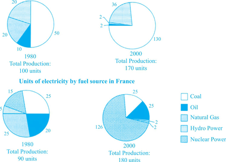
①The four pie charts give information on the electricity produced by five different fuels in Australia and France in 1980 and 2000.
②50 units of electricity was produced by coal in Australia in 1980, which occupied half of the total production in that year. ③This figure then surged to 130 units in 2000. ④Another fuel that showed an increase was hydro power, with the electricity production rising from 20 units to 36 units. ⑤In contrast, both natural gas and oil presented a decline, from respectively 20 and 10 units to 2 units each.
⑥Different from Australia, France relied on nuclear power. ⑦Although it only generated 15 units of electricity in 1980, inferior to coal (25 units), natural gas (25 units) and oil (20 units), it contributed to the majority of electricity production by 2000 (126 units). ⑧Meanwhile, coal remained unchanged and oil experienced a slight growth to 25 units, whereas both natural gas and hydro power dropped to 2 units.
⑨Overall, the total electricity production showed a surge in both countries, which could mostly be attributed to coal in Australia, and nuclear in France.
(184 words)
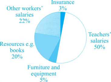
The three pie charts below show the changes in annual spending by a particular UK school in 1981, 1991 and 2001.
Summarise the information by selecting and reporting the main features, and make comparisons where relevant.
Total School Spending 1981
Total School Spending 1991
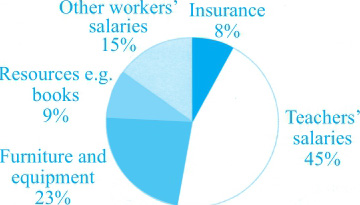
Total School Spending 2001
Overview
员工薪水占据学校支出的绝大部分,对应②⑨。
Main Features
(1)teachers’salaries占比总体上升,在1991年到达顶峰,对应④。
(2)furniture and equipment占比总体上升,在1991年达到低谷,对应⑤。
(3)insurance占比最小,但一直上升,对应⑦。
(4)other workers’salaries和resources e.g. books占比下降,2001年分别为15%和9%,对应⑧。
Relevant Comparison
(1)共同点及不同点:teachers’salaries、furniture and equipment和insurance占比都总体上升,对应④⑤⑥⑦;而other workers’salaries和resources e.g. books占比总体下降,对应⑧。
(2)对象之间数据大小的比较:1981年other workers’salaries占比几乎是resources e.g. books和furniture and equipment的两倍,对应③。
NB: Please note that this is just one example out of many possible approaches.
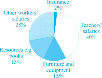
①The three pie charts give a breakdown of how the total school spending was allocated in a UK school in 1981, 1991 and 2001. ②It can be seen that teachers’salaries had remained the dominating sector throughout the given years.
③Teachers’salaries took up 40% in 1981, followed by other workers’salaries (28%), which almost doubled resources e.g. books and furniture and equipment (15%). ④Then during the following two decades, teachers’salaries had shown a rise to 45% by 2001, though the peak was in 1991 (50%). ⑤Furniture and equipment also enjoyed a general growth, accounting for 23% in 2001, but there was a trough in 1991 (5%). ⑥Another sector that presented a rise was insurance. ⑦Despite being the least favoured item during the given period, the spending on it surged to 8% by 2001.
⑧In contrast, expenditure on other workers’salaries and resources e.g. books had declined over the given years, to 15% and 9% respectively in 2001.
⑨Overall, the majority of school spending was on the staff’s salaries.
(170 words)
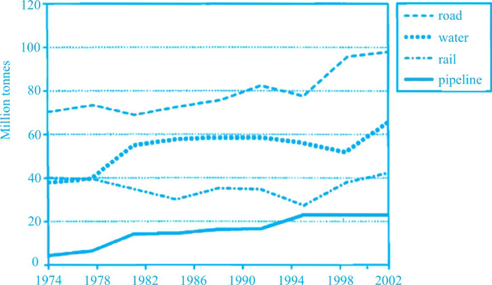
The graph below shows the quantities of goods transported in the UK between 1974 and 2002 by four different modes of transport.
Summarise the information by selecting and reporting the main features, and make comparisons where relevant.
Goods transported in UK (1974—2002)
Overview
除了rail的运输量基本不变,别的几种运输方式的运输量都呈上升趋势。对应②。
Main Features
(1) road的运输量持续上升。对应③。
(2) pipeline的运输量在20世纪80年代初到90年代初以及1995年到2002年期间分别有一段稳定的区间。对应⑤。
(3) water的运输量总体上升,而rail的运输量在波动之后回到原点。对应⑦。
Relevant Comparison
(1)共同点:从趋势上看,road、water和pipeline的运输量都总体上升。对应③⑤⑦。
(2)不同点:pipeline的运输量有两段保持稳定的区间。对应⑤。
(3)对象之间数据大小的比较: pipeline 2002年的运输量近乎1974年的5倍。对应⑤。
NB: Please note that this is just one example out of many possible approaches.
①The line graph shows the information of how many goods were delivered by four different means of transport, namely, road, water, rail and pipeline, in the UK from 1974 to 2002. ②Over this span of nearly 30 years, the quantities transported by all the means had generally increased with the only exception in rail whose figure had kept at the level of more or less around 40 million tonnes.
③Road had transported the highest quantities of goods at all time in the graph, with 72 million tonnes in 1974 rising moderately to just under 100 million tonnes in 2002. ④Pipeline showed a different trend. ⑤Being the least used means to transport goods, it experienced two long stable periods: one from the early 1980s to the early 1990s, and the other during the last 7 years in the graph, though the figure in 2002 was a roughly 5-fold climb compared with that in 1974.
⑥Goods transported through water and rail started at the same level at 40 million tonnes and had stayed there within the first four years. ⑦Since then, the former had went up gradually by a further 20 million all the way to 2002; while the latter returned to 40 million tonnes after two decades of fluctuations within 20 million tonnes to 40 million tonnes.
⑧To sum up, road was the most preferred means of transporting goods, followed by water and rail. ⑨Pipeline lied the last among all.
(239 words)
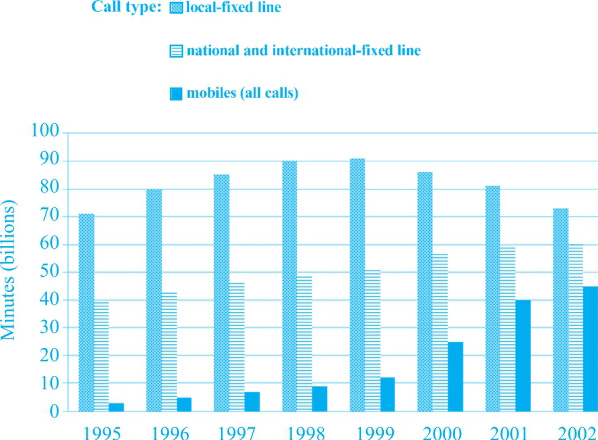
The chart below shows the total number of minutes (in billions) of telephone calls in the UK, divided into three categories, from 1995—2002.
Summarise the information by selecting and reporting the main features, and make comparisons where relevant.
UK Telephone calls, by category, 1995—2002
Overview
国内和国际长途以及手机通话时长均为上升趋势,而本地固话通话时长在80 billion分钟左右波动,对应②。
Main Features
(1)国内和国际长途通话分钟数上涨缓慢,对应③。
(2)手机通话分钟数前五年增长缓慢,从2000年至2002年剧增至50 billion分钟,对应④。
(3)本地固话分钟数在1998和1999年上升至最高点90 billion,对应⑥,后三年缓慢下降到起点数值,对应⑦。
Relevant Comparison
(1)共同点:国内和国际长途以及手机通话分钟数均为总体上升趋势,对应②。
(2)不同点:本地固话时长为先升后降趋势,对应⑤⑥⑦。
(3)对象之间数据大小的比较:本地固话分钟数位于第一,国内和国际长途和手机通话时长位于其后,对应⑧。
NB: Please note that this is just one example out of many possible approaches.
①The bar chart tells us the information of how long three kinds of UK telephone calls were made from 1995 to 2002. ②Over this span of seven years, the total minutes of national and international-fixed line and mobiles had both increased while those of local-fixed line had kept on the approximately same level at slightly over 80 billion.
③The minutes of national and international-fixed line grew gradually from nearly 40 billion to around 60 billion before staying at that level within the last two years in the question. ④Those of mobiles experienced a moderately upward trend across the first five years till 2000, from which point it increased greatly to about 50 billion minutes till 2002.
⑤Time of using local-fixed line showed a different pattern from two of its counterparts above. ⑥This figure went up from 70 billion minutes in 1995 to the peak at over 90 billion minutes in both 1998 and 1999. ⑦The last three years witnessed a slowly reducing trend to 2002, when it returned to just the same level as it was in the beginning.
⑧From the graph, we can see that local-fixed line was the mostly used mode of communication in the UK between 1995 and 2002, followed by national and international-fixed line and mobiles.
(210 words)
The charts below give information on the ages of the populations of Yemen and Italy in 2000 and projections for 2050.
Summarise the information by selecting and reporting the main features, and make comparisons where relevant.
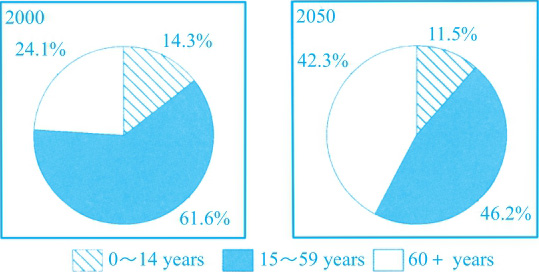
ITALY
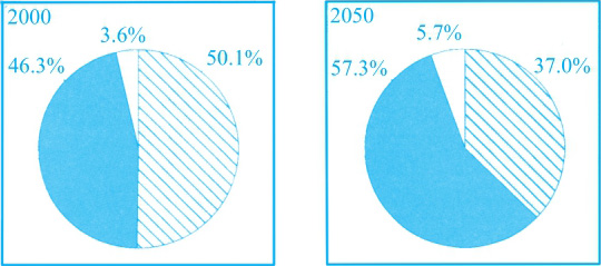
YEMEN
Overview
和意大利相比,也门将来成为老龄化社会的可能性较小,对应⑦。
Main Features
(1)15~59岁人口比例预计将在也门上升近10%,而在意大利有明显下降,对应③。
(2)60岁以上人口比例在两国均为上升趋势,前者缓慢上升,后者剧烈上升,对应④。
(3)14岁以下人口比例在也门从一半下降到40%以下,对应⑤;相似的是,该年龄段人口比例在意大利同样下降,下降到总人口的1/10左右,对应⑥。
Relevant Comparison
(1)数据Main Features的呈现即为做共同点和不同点的比较。
(2)对象之间数据大小的比较:15到59岁年龄段人口比例除了在2000年的也门略低于14岁以下年龄段外,在也门的2050年以及意大利的两个年份中均占最大比例(50%左右),对应②。
难点分析:注意三个年龄段的多样化表述。`
NB: Please note that this is just one example out of many possible approaches.
①The four pie charts show how the population of three different age groups in Yemen and Italy is likely to change over a 50-year period from 2000 to 2050. ②Generally, the group of 15-59 years old constituted and is predicted to constitute the largest portion of more or less than half in both of the countries, except that the percentage was only slightly lower than its younger counterpart in Yemen in 2000. ③While this figure is projected to increase by a 10% or so in Yemen, it will experience a noticeable decrease from 61.6% to 46.2% in Italy.
④Looking at the other two age groups, the oldest one made up with people from 60 years old above in either Yemen or Italy tends to show an upward trend, rising gently from 3.6% to 5.7% in the former whereas considerably from 24.1% to 42.3% in the latter. ⑤The youngest group under 14 years old accounted for slightly over a half in 2000 in Yemen, reducing to just under 40% five decades later. ⑥In Italy, similarly, this figure is predicted to drop by 3% in 2050 when it will occupy a bit over one-tenth of the whole population.
⑦To sum up, Yemen is and will be a less aging society compared with its counterpart—Italy.
(213 words)
The graph below gives information from a 2008 report about consumption of energy in the USA since 1980 with projections until 2030.
Summarise the information by selecting and reporting the main features, and make comparisons where relevant.
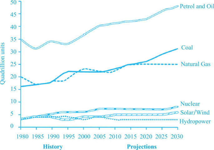
U.S. Energy Consumption by Fuel (1980—2030)
Overview
除水能外其他所有能源的消耗整体均为上升趋势,而水能的消耗在略低于5 quadrillion的数值水平上基本保持稳定,对应②。
Main Features
(1)尽管在20世纪有两次短时间小幅下降,汽油和石油的消耗在整段时间内均呈缓慢上升趋势,对应④。
(2)核能和太阳能/风能的消耗均为缓慢上升趋势,对应⑦。
Relevant Comparison
(1)共同点:核能、太阳能/风能与水能的消耗数值相似,对应⑧。
(2)不同点:最初天然气的消耗大于煤的消耗,50年后后者将超过前者,对应⑥。
(3)对象之间数据大小的比较:直至2030年,汽油和石油一直保持能源消耗第一的地位,煤和天然气位于其后,对应③⑤⑨。
难点分析:
(1)本图为混合时态图表,在描述未来时段时可单独采用将来时态。(本文没有提及)
(2)天然气在2015年后和水能在2012年后的数值保持不变,可单独叙述。(本文没有提及)
NB: Please note that this is just one example out of many possible approaches.
①The line graph gives an overview with predictions of how US energy consumption by six different kinds of fuel changed and will change from 1980 to 2030. ②Overall, energy consumed by all types is reported to increase with the only exception in hydropower, which is forecast to show a constant trend at the level of slightly under five quadrillion units, lowest nearly at all times among the six.
③The highest consumption was and will be found in petrol and oil. ④This figure rose gradually from 1980 onwards to reach 50 quadrillion units in 2030 in spite of two fairly short periods of marginal drop in the 20th century.
⑤Energy produced by natural gas and coal was and is projected to be the second popular kinds of fuel, ranging from 15 quadrillion units to 30 quadrillion units. ⑥The former outnumbered the latter in the beginning while the trend is expected to reverse 50 years later.
⑦Nuclear, solar and wind power both experienced a very slowly growing trend at the level of 5 quadrillion units or so. ⑧These figures are quite close to that of hydropower.
⑨All in all, petrol and oil had been responsible for the largest share of energy production and this trend tends to continue till 2030.
(208 words)
The tables below give information about sales Fairtrade-labelled coffee and bananas in 1999 and 2004 in five European countries.
Summarise the information by selecting and reporting the main feature, and make comparisons where relevant.
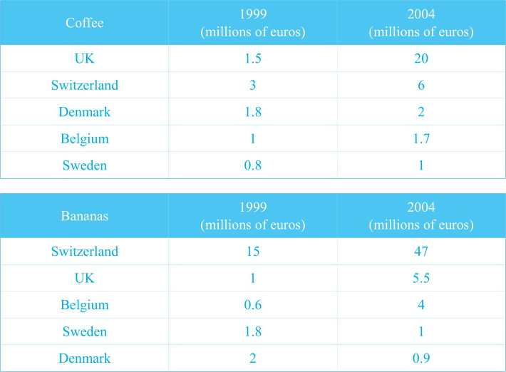
Sales of Fairtrade-labelled coffee and bananas (1999 & 2004)
Overview
在5年中咖啡销量在各国均有不同程度上升,而香蕉销量既有上升又有下降,对应②。
Main Features
(1)咖啡:英国的销量剧烈上升,由第三名上升为第一名,对应③④;瑞士的销量上升到两倍,在2004年的销量仅次于英国,对应⑤⑥;相比较下其他三种的销量上升较小,对应⑦。
(2)香蕉:瑞士、英国和比利时的销量为上升趋势,对应⑧;其中瑞士的销量上升最剧烈,对应⑨;瑞典和丹麦的销量为下降趋势,对应⑩⑪。
Relevant Comparison
(1)两张图中的不同点由Overview进行了整体描述。Main Features的呈现即为做共同点和不同点的比较。
(2)对象之间数据大小的比较:1999年和2004年咖啡最高的销量分别出自于瑞士和英国。而在这两年间香蕉最高的销量都出自于瑞士。
NB: Please note that this is just one example out of many possible approaches.
①The two tables show the sales figures of coffee and bananas labelled fair-trade in five nations in Europe in 1999 and 2004. ②Over this span of five years, sales of coffee in all the countries had increased though to various degrees, whereas those of bananas had both climbed and reduced.
③From the graph of coffee, UK sold 1.5 million euros in 1999 when it ranked the third among the five. ④This figure shot to 20 million euros to take the first place in 2004. ⑤No countries made more profits than Switzerland in 1999—3 million euros. ⑥Doubling to 6 million euros in 2004, this figure remotely followed that in UK. ⑦The rise in the remaining three countries, however, was minor compared to the above two nations.
⑧Turning to bananas, there were considerable growths in the sales figures in Switzerland, UK and Belgium. ⑨Among them, the rise in Switzerland was the most significant and the figures in both of the years were the greatest. ⑩Sweden and Denmark showed an opposite trend. ⑪These figures experienced a downward trend, declining from 1.8 million euros to 1 million euros in the former while 2 million euros to 0.9 million euros in the latter.
(199 words)
The charts below show the proportions of British students at one university in England who were able to speak other languages in addition to English, in 2000 and 2010.
Summarise the information by selecting and reporting the main features, and make comparisons where relevant.
% of British Students able to speak languages other than English, 2000
% of British Students able to speak languages other than English, 2010
Overview
1)能讲第二外语的学生比例上升,对应②。
2)学生第二外语的选择多样化,对应⑧。
Main Features
(1)讲西班牙语的学生比例增加,而讲法语的学生比例下降,讲德语的学生比例不变,对应⑤。
(2)不会第二外语的学生比例下降,而会讲一门或两门其他外语的学生比例增加,对应⑦。
Relevant Comparison
讲西班牙语的学生比例一直最大,对应③。
NB: Please note that this is just one example out of many possible approaches.
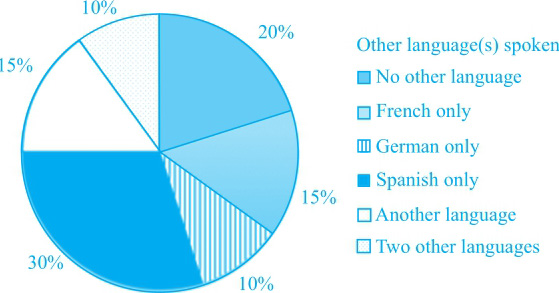
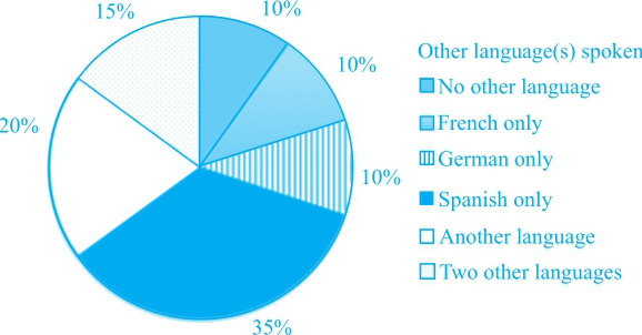
①The two pie charts indicate the change in the proportion of students who can speak other languages apart from English in one university in England in 2000 and 2010. ②It can be seen that the total proportion of students speaking languages other than English had increased over the given period.
③According to the charts, the second languages that students in that university were able to speak mainly consisted of French, German and Spanish, with Spanish being the most popular one. ④30% of the students spoke Spanish, while only half of that proportion spoke French and 1/3 spoke German. ⑤Then in contrast to the increase in Spanish only by 5% in 2010, French showed a 5% decline and German stayed unchanged.
⑥There are three other sectors: no other language, another language and two other languages. ⑦A remarkable drop can be seen in students who speak no other language, from 20% to 10%, while those who speak one or two other languages rose respectively from 15% to 20%, and from 10% to 15%.
⑧Overall, despite Spanish being the dominating second language during the given period, the students’choices tend to be diversified.
(190 words)
The graph below shows average carbon dioxide (CO 2 ) emissions per person in the United Kingdom, Sweden, Italy and Portugal between 1967 and 2007.
Summarise the information by selecting and reporting the main features, and make comparisons where relevant.
Average carbon dioxide(CO 2 ) emissions per person, 1967—2007
Overview
英国CO 2 的排放量一直是最高的,而葡萄牙的排放量一直是最低的,对应②。
Main Features
(1)在1967年,英国的排放量最大,瑞典紧随其后,意大利和葡萄牙少很多,对应③④。
(2)英国的排放量在2007年达到历史最低;瑞典和葡萄牙在该年的排放量相似,对应⑥⑦。
Relevant Comparison
(1)相同点:2007年瑞典和葡萄牙的排放量相同,对应⑦。
(2)不同点:从1967到2007年四国CO 2 排放量的变化大为不同,对应⑤。
NB: Please note that this is just one example out of many possible approaches.
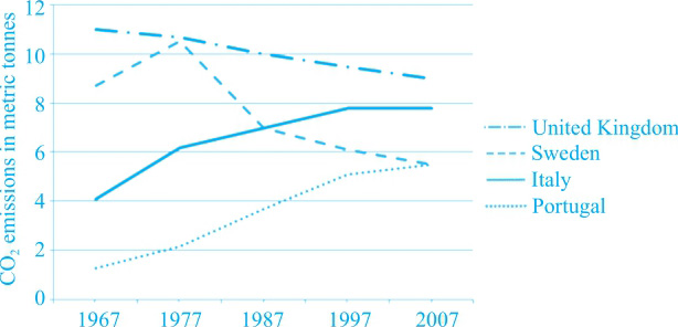
①The line graph compares the average amount of emitted carbon dioxide (CO 2 ) per head in the UK, Sweden, Italy and Portugal from 1967 to 2007. ②It is worth noting that the CO 2 emission in Britain was consistently higher than any other three countries throughout the entire period as listed while that in Portugal was continuously the least.
③In the year of 1967, it is clear that the UK was main culprit of CO 2 releaser with around 11 metric tonnes per person, closely followed by Sweden at roughly 9 metric tonnes. ④Italy and Portugal contributed far less CO 2 than the former, at only 4 metric tonnes and about 1 metric tonne respectively.
⑤In the next forty years, the figure for greenhouse gas in all four countries experienced completely contrasting trends. ⑥United Kingdom witnessed a gradual drop in its figure and reached its historically low point in the year of 2007 at around 9 metric tonnes while the number in Sweden also declined in general despite a soar from 1967 to 1977, approaching 10.5 metric tonnes as its ultimate point. ⑦By contrast, the volume of CO 2 produced by Italy exceeded that of Sweden in 1987 and then increased significantly to around 8 metric tonnes in the next ten years, and that in Portugal rose to 5.5 metric tonnes which resembled the figure for Sweden in 2007.
⑧To sum up, UK still topped in the rank of CO 2 release while the gap among four countries provided narrowed considerably across the whole period.
(249 words)
The chart gives information on the percentage of British people giving money to charity by age range for the years 1990 and 2010.
Summarise the information by selecting and reporting the main features, and make comparisons where relevant.
Overview
(1)50岁以下年龄层的捐款额呈现下降趋势,50岁以上年龄层的捐款额呈现上升趋势,对应②。
(2)36岁以上年龄层的捐款额总体大于36岁以下的捐款额,对应⑦。
Main Features
(1)18~25岁年龄层的捐款额大幅下降,对应③;26~35岁、36~50岁年龄层的捐款额小幅下降,对应④。
(2)51~65岁、65岁以上年龄层的捐款额上升,对应⑤。
Relevant Comparison
(1)共同点和不同点:前三个年龄段的捐款额均呈现下降趋势,而后两个年龄段的捐款额呈现上升趋势,对应②。
(2)对象之间数据大小的比较:1990年最大的捐款额来自36~50岁年龄层,对应④;2010年最大的捐款额来自51~65岁年龄层,对应⑥。
难点分析:不同年龄层的描述对象的同义替换的表达。
NB: Please note that this is just one example out of many possible approaches.
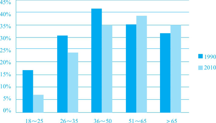
①The bar chart shows how generous five different British age groups were when it came to monetary donation to charity in two separate years of 1990 and 2010. ②From the graph, we can see that while the percentage of British under the age of 50 all experienced a downward trend, the opposite was true with it over 50 years old.
③To be specific, just over 15% of the youngest group donated money in 1990, more than halving to slightly over 5% 20 years later. ④With a decreasing trend in both, the other two groups with the age of 26-35 years old and 36-50 years old respectively showed a relatively marginal drop by around 5%, though the latter was the biggest donor in 1990 which accounted for more than two-fifths of all.
⑤Turning to the two older counterparts that had their proportions of donors climb with a moderate range, those in their 50s and early 60s took the second place with over one-third in 1990. ⑥This figure rose to rank the first after 20 years when it made up nearly 40%.
⑦It is clear that compared with people from 36 years old and above in Britain who were the major contributors to charity, those under it made less significant contribution.
(210 words)
The chart below gives information about Southland’s main exports in 2000, *20... and the future projections for 2025.
Summarise the information by selecting and reporting the main features, and make comparisons where relevant.
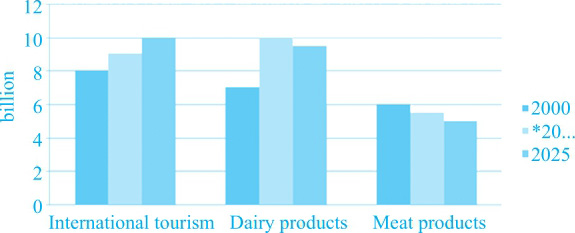
Southland’s main exports in 2000 and *20..., and future projections for 2025
(*20...: for test purposes, use and refer to the current year)
Overview
(1)2000—2015年,international tourism和dairy products的出口额均呈现上升趋势;Meat products的出口额呈现下降趋势,对应②。
(2)2025年,international tourism出口额预计上升,另两者预计下降,对应③。
Main Features
(1)international tourism的出口额持续上升,对应④和⑤。
(2)meat products的出口额持续下降,对应⑥和⑦。
(3)dairy products的出口额先升后降,对应⑧和⑨。
Relevant Comparison
(1)共同点:从变化趋势来看,在前15年间,international tourism和dairy products是相同的;在后10年间,dairy products和meat products是相同的。对应②③。
(2)不同点:前15年间的meat products和后10年间的international tourism的出口额变化趋势都有别于其他两项,对应②③。
(2)对象之间数据大小的比较:meat products的出口额相对最低,对应⑩。难点分析:
(1)将来时和过去时的交替使用。
(2)题目中的*20...根据题目要求可改为考试当时的年份,范文中改作2015。
NB: Please note that this is just one example out of many possible approaches.
①The bar graph gives an overview of how three kinds of Southland’s main exports changed between 2000 and 2015 and the predictions in 2025. ②Over the first 15 years, profits made from international tourism and dairy products had both increased while those from meat products had decreased. ③The year 2025 is expected to see a continuous upturn in international tourism but a downward trend in two of its counterparts.
④To be more precise, international tourism experienced a gradual rise of 1 billion pounds in 2015 to reach almost 9 billion pounds. ⑤A further 1 billion is forecast ten years later in 2025. ⑥In contrast, the export of meat products saw an opposite trend. ⑦This figure declined from 6 billion pounds to 5.5 billion pounds and the decline will not stop until 2025, when it represents only 5 billion pounds. ⑧Dairy goods is the only category that shows a fluctuation in its export. ⑨Starting at nearly 7 billion pounds in 2000, it significantly climbed to peak at slightly under 10 billion pounds but is likely to drop marginally to 9.5 billion pounds after a decade.
⑩From the graph, we can see that meat products are much less exported in Southland in either of the three years than the other two exported items.
(211 words)
The pie charts below show the online shopping sales for retail sectors in New Zealand in 2003 and 2013.
Summarise the information by selecting and reporting the main features, and make comparisons where relevant.
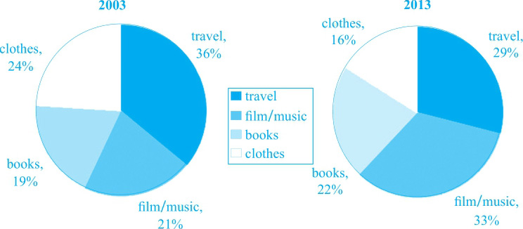
Online sales for retail sectors in New Zealand
Overview
books和film/music的网络零售额呈现上升趋势,travel和clothes呈现下降趋势,对应②。
Main Features
(1)2003年的网络零售额排位情况,对应③⑤⑦⑧。
(2)2013年的网络零售额排位情况,对应④⑤⑦⑧。
(3)各个项目的具体变化,对应④⑤⑥⑦⑧。
Relevant Comparison
(1)共同点:从变化趋势上来看,books和film/music是相同的;travel和clothes是相同的。
(2)不同点:除了变化趋势上两组的不同外,2003年和2013年各项网络零售额的排位情况也有所不同。
(3)对象之间数据大小的比较:总体而言,travel和film/music的网络零售额相对要高于另外两项,对应⑨。
难点分析:
数据的数量比较少,既需要进行同一对象自身变化趋势的描述,也需要进行同一年不同对象之间的比较,并将两者进行有机的结合。
NB: Please note that this is just one example out of many possible approaches.
①The two pies give information about how online sales for four different retail sectors changed in New Zealand in 2003 and 2013. ②Over this span of ten years, the sales figures in books and film/music had both increased while those in travel and clothes had decreased correspondingly.
③To be more precise, only 19% of books were sold online in a retail manner, the smallest figure in that year of 2003. ④A slow rise of 3% could be seen in 2013 when it ranked the last but one. ⑤The biggest share of online sales in 2013 was taken up by film/music, which climbed significantly from slightly above one-fifth ten years ago.
⑥Two of their counterparts, namely, travel and clothing, saw an opposite trend. ⑦The former declined to under 30% in 2013, taking the second place of the four whereas in 2003, it accounted for over one-third of all, ranking the first. ⑧The amount of drop in the latter was quite close to that in travel, from 24% in 2003 to 16% a decade later.
⑨From the chart, we can see that online retail selling favoured travel, film and music more than the other two items.
(194 words)
The chart below shows the changes that took place in three different areas of crime in Newport city centre from 2003 to 2012.
Summarise the information by selecting and reporting the main features, and make comparisons where relevant.
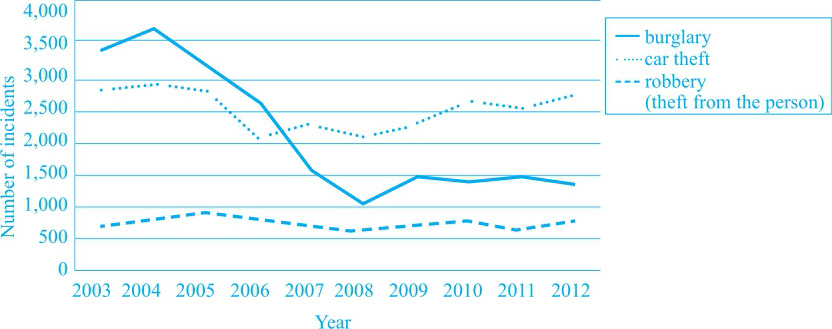
The changing rates of crime in the inner city(2003—2012)
Overview
三种犯罪率中,burglary呈下降趋势、car theft和robbery总体持平,对应②。
Main Features
(1)burglary的犯罪率在大起大落之后呈现平稳趋势,最高点出现在2004年,最低点出现在2008年,对应③④。
(2)car theft的犯罪率呈现持平、下降、缓慢上升的趋势,最低点出现在2006年,对应⑤⑥⑦。
(3)robbery的犯罪率在500起到1000起之间震荡,最高点出现在2005年,最低点出现在2008年,对应⑧。
Relevant Comparison
(1)共同点:本图中除了car theft和robbery在起终点的数据均为接近外,无其他共同点。
(2)不同点:三种犯罪率的变化趋势各不相同。
(3)对象之间数据大小的比较:总体而言,robbery的犯罪发生率相对较低,对应⑨。
难点分析:年份比较多,对应的点也比较多。在选择数据点的时候,必须要写的是极值点、持平点和引出明显变化的点,也可以选择写起终点的排名(本文中没有提及)。对于burglary和car theft来说,2006年和2007年之间是一个转折点,在转折点前,前者大于后者,之后则相反(本文中没有提及)。
NB: Please note that this is just one example out of many possible approaches.
①The line graph gives an overview of the changing rates of three different kinds of crimes in the inner city of Newport city between 2003 and 2012. ②Over this period of nine years, the number of incidents of burglary had decreased while that of car theft and robbery had both kept more or less constant, with the former at a little under 3,000 and the latter slightly above 500.
③To be more precise, burglary increased to reach its peak at about 3,750 incidents in 2004 before dropping rapidly through the next four years to hit the lowest point of over 1,000 incidents. ④The last four years saw a stable trend at under 1,500 incidents.
⑤In terms of stealing cars, this figure stabilised at fewer than 3,000 incidents from 2003 to 2005. ⑥The following year witnessed a plummet to the historic low of 2,000 incidents. ⑦There had been a gradual rise of 750 incidents across the subsequent 6-year period.
⑧Turning to theft from the person, it experienced ups and downs within the range between 500 and 1,000 incidents across the whole time period, with the smallest figure being found in 2008 at exactly 500 incidents while 2005 was the year when this crime was the most serious, approaching 1,000 incidents.
⑨From the graph, we can see that robbery was the kind of crime that happened the least frequently, compared with two of its counterparts.
(233 words)
The chart below shows the annual number of rentals and sales (in various formats) of films from a particular store between 2002 and 2011.
Summarise the information by selecting and reporting the main features, and make comparisons where relevant.
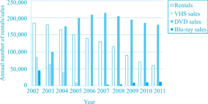
Overview
rental和DVD sales的数字总体最大;VHS sales存在于2002年到2005年,Blu-ray sales存在于2007年到2011年,对应②。
Main Features
(1)rental的变化趋势为一路下降,对应③。
(2)DVD的销售数字呈现先升后降的趋势,最高点出现在2007年,对应④。
(3)VHS的销售数字呈现一路下降的趋势,并在2006年彻底消失,对应⑤⑥。
(4)Blu-ray在2007年出现并呈现销量逐步上升的趋势,对应⑦⑧。
Relevant Comparison
(1)共同点:没有明显共同点。
(2)不同点:除了变化趋势方面的不同以外,rental为租借,其他三项均为销售。
(3)对象之间数据大小的比较:总体而言,DVD sales和rental的销量始终大幅居上,对应②。
难点分析:年份比较多,对应的点也比较多。在选择数据点的时候,必须要写的是极值点、持平点和引出明显变化的点。
NB: Please note that this is just one example out of many possible approaches.
①The bar chart gives an overview of how the yearly number of rentals and three formats of sales of films changed from 2002 to 2011 in a certain store. ②Over this span of nine years, rental and DVD sales had been two of the much more popular ways than two of their counterparts, namely, VHS sales which went into a total disappearance in 2006, and Blu-ray sales which was not seen until 2007.
③As to the only way of appreciating films other than buying, rentals had experienced a gradual and continuous decline in its number to over 50,000 in 2011, a drop of over two-thirds of its number in 2002.
④The number of DVD sales, on the other hand, increased sharply to reach its peak at over 200,000 in 2007, before decreasing step by step by 20,000 four years later. ⑤VHS was so popular that the sales of it outnumbered DVD by twice in 2002. ⑥It showed a downward trend in the next three successive years and finally was driven out of the market in 2006. ⑦Blu-ray was released into the market in 2007 but at that time, it was sold at a very low and ignorable level in this store. ⑧After slowly rising within the five-year period, it reached above 10,000 in 2011.
(214 words)