


Sample questions and model answers 例题及标准答案
Task 1 Chart 1
Summarise the information shown by selecting and reporting the main features. Make comparisons where relevant.
You should spend around 20 minutes on this task. You should write at least 150 words.
通过选择和报告主要特征来总结显示的信息。在相关的地方进行比较。
你应该花 20 分钟来完成这项任务。至少 150 字。
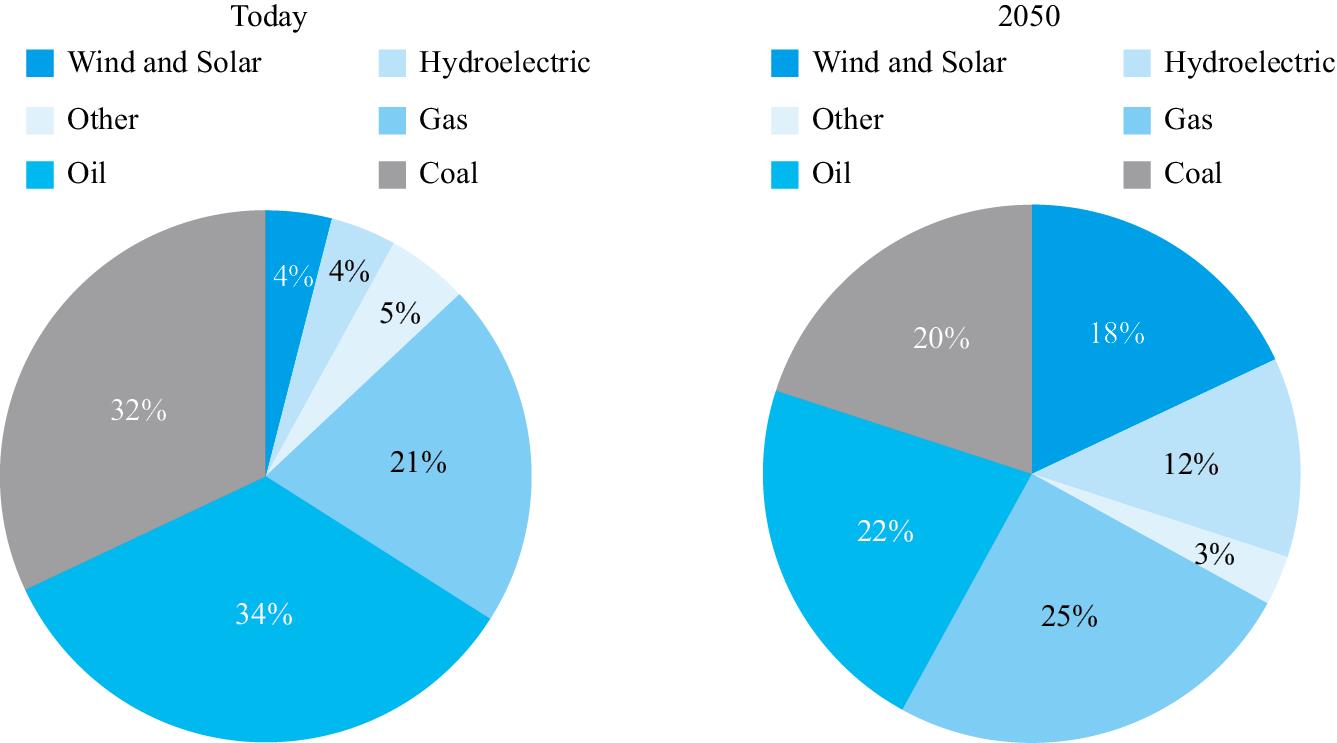
Current sources of energy in the USA, with predictions for 2050
The charts show how energy is currently produced in the USA, and predicts changes until 2050. It is clear that, while energy generation now relies overwhelmingly on fossil fuels, a far higher proportion of renewable energy is predicted to be used in 2050.
Looking at the situation today, it is clear that the USA is highly dependent on fossil fuels for its energy production. Coal, at 32%, gas at 21%, and oil at 34%, produce 87% of energy requirements in the United States. Renewable sources, in the form of hydroelectric power, wind and solar energy produce only 8% of its current needs, while other production methods generate a mere 5%.
Turning to predictions for 2050, we can see that renewable sources are expected to provide a much larger percentage of America's energy demand. Wind and solar energy, and hydroelectric power, are set to increase dramatically, rising from 8% to 30% of the total requirement. However, this still means that almost 70% of the USA's energy will be produced using fossil fuels, with gas, oil and coal providing 25%, 22% and 20% of energy production. The remaining 3% will be provided by other methods.
当你写关于这个话题的文章时,可以使用这些短语 ! Include these phrases when writing essays about this topic!
Currently produced 目前生产
Energy generation 能源的产生
Relies overwhelmingly 绝大多数依赖于
Hydroelectric power 水力发电
Renewable sources 可再生能源
Task 1 Chart 2
Summarise the information shown by selecting and reporting the main features. Make comparisons where relevant.
You should spend around 20 minutes on this task. You should write at least 150 words.
通过选择和报告主要特征来总结显示的信息。在相关的地方进行比较。
你应该花 20 分钟来完成这项任务。至少 150 字。
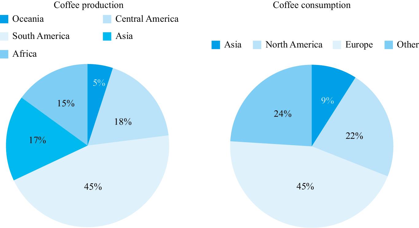
Current worldwide coffee production and consumption
The two bar charts provide information about where coffee is produced, and where it is consumed. It is clear that while production comes largely from Asia, Africa, and South and Central America, consumption takes place elsewhere, principally in Europe, North America and Asia.
Looking first at the figures for production, the first key point to note is that South America produces almost half of the world's coffee, at 45%. Africa, Central America and Asia are also significant producers, with 15%, 18% and 17% respectively, with Oceania the only other notable producer, at 5%.
In contrast, consumption takes place largely in non-producing countries. Europe, at 45%, is the largest consumer of coffee, while 22% is drunk in North America, and 24% in other countries. Therefore, according to the chart, 67% of coffee drinking takes place in areas where it is not produced. The only area of coffee production that also consumes a significant amount is Asia, where 17% is produced and 9% consumed.
当你写关于这个话题的文章时,可以使用这些短语 ! Include these phrases when writing essays about this topic!
Provide information about 提供了关于……的信息
Principally 主要
Notable producer 著名的生产商
Non-producing countries 非生产国
Task 1 Chart 3
Summarise the information shown by selecting and reporting the main features. Make comparisons where relevant.
You should spend around 20 minutes on this task. You should write at least 150 words.
通过选择和报告主要特征来总结显示的信息。在相关的地方进行比较。
你应该花 20 分钟来完成这项任务。至少 150 字。
The two charts show the locations of forests throughout the world by continent, and the percentage of world timber consumption in each part of the world. We can see clearly that there is a basic balance between forest cover and consumption, although some areas produce more than they consume, while others consume more than they produce.
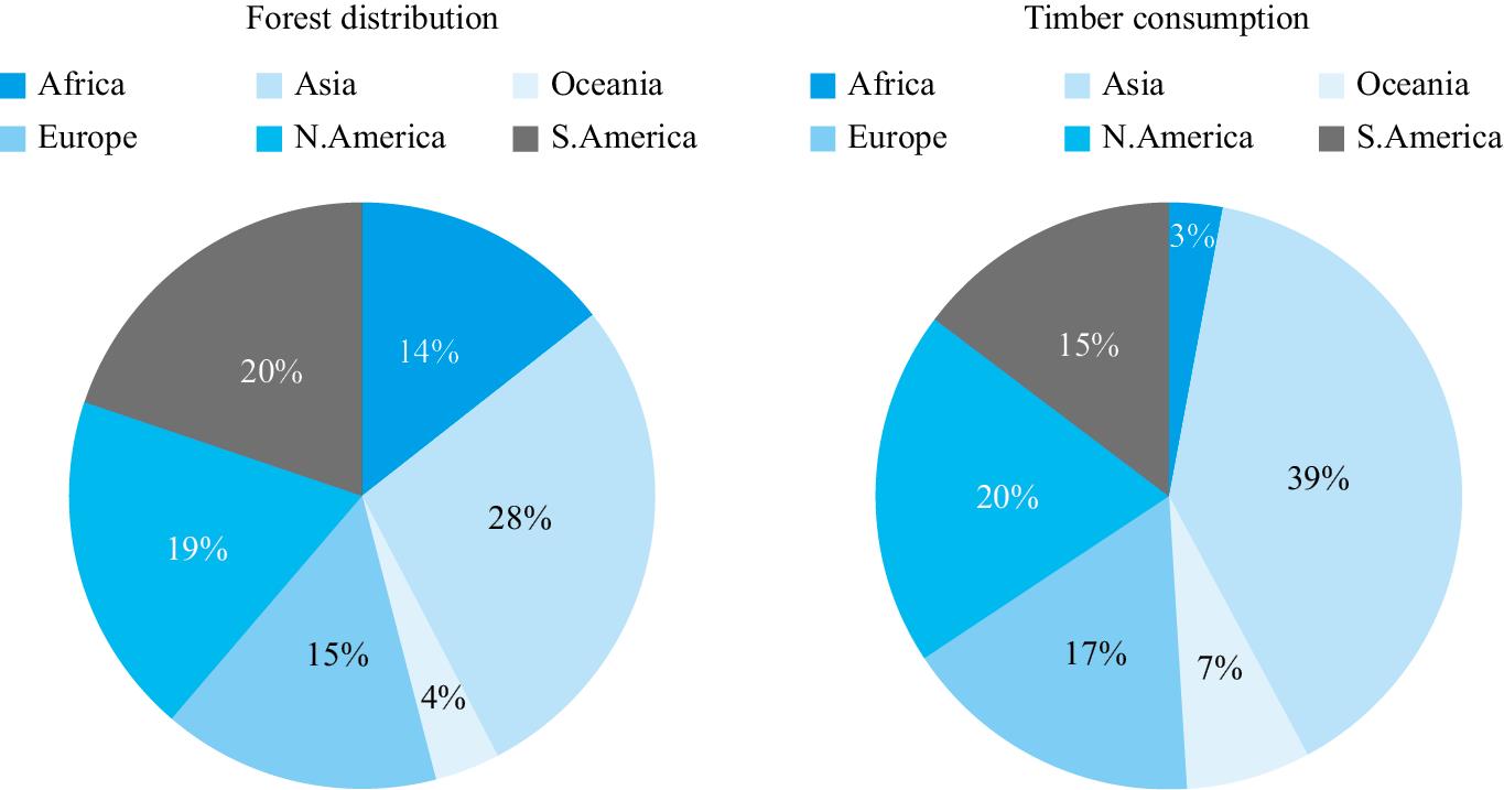
Worldwide forest distribution and timber consumption
Looking first at the percentage of forest cover in each continent, it is clear that South America, North America and Asia make up the highest proportion of world forests at 22%, 21% and 31% respectively. Africa and Europe are also the location for significant forest cover at 14% and 15% respectively. Turning to the consumption of timber produced from these forests, we can see that by far the biggest user is Asia, at 39%. The other three substantial consumers of wood are South America, at 15%, North America at 20%, and Europe at 17%.
If we compare the percentage of forest cover with timber production, we can see that the most significant differences are in Africa, Asia and Oceania. While Africa has 14% of world forests, it consumes only 3% of the timber produced, and, in contrast, Asia, with only 28% of the worlds forests, consumes 39% of its wood. Similarly, Oceania consumes 7%, while only having 4% of the world's forests.
当你写关于这个话题的文章时,可以使用这些短语 ! Include these phrases when writing essays about this topic!
Locations by continent 按大陆显示……位置
Percentage of forest cover 森林覆盖率
Make up the highest proportion 所占比例最高
Task 1 Chart 4
Summarise the information shown by selecting and reporting the main features. Make comparisons where relevant.
You should spend around 20 minutes on this task. You should write at least 150 words.
通过选择和报告主要特征来总结显示的信息。在相关的地方进行比较。
你应该花 20 分钟来完成这项任务。至少 150 字。
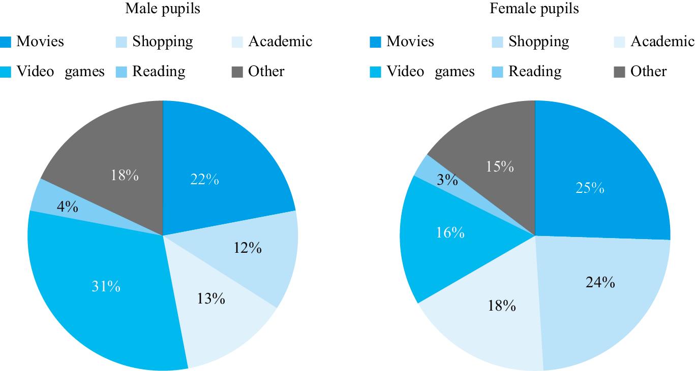
Time spent on the internet for six purposes by male and female pupils at a school in Australia.
The two charts show how the Internet is used by girls and boys studying at one particular place of learning in Australia. It is clear that there are significant differences in internet use between the two groups.
Amongst male pupils, playing video games is the most time-consuming activity, at 31%, almost double the figure for female pupils, at 16%. However, the proportions are reversed in the case of online shopping, which males only spend 12% of their time doing, whereas double the number of female pupils do this, 24%. The other differences between the genders are less dramatic.
In contrast to playing video games, online shopping and watching movies, a tiny amount of time is spent by both boys and girls on reading, at 4% and 3% respectively, and similar percentages of time, 13% for boys and 18% for girls is spent engaged in other activities. Time spent watching movies is also an important part of their Internet usage, with 22% of time spent doing this by boys, and 25% by girls. Overall, we can see that certain activities, specifically shopping, watching movies, and academic study are more popular with girls, whereas playing video games, and other activities, are preferred by boys.
当你写关于这个话题的文章时,可以使用这些短语 ! Include these phrases when writing essays about this topic!
Most time-consuming 最耗时的
Proportions are reversed 比例是相反的
Engaged in other activities 从事其他活动
Task 1 Chart 5
Summarise the information shown by selecting and reporting the main features. Make comparisons where relevant.
You should spend around 20 minutes on this task. You should write at least 150 words.
通过选择和报告主要特征来总结显示的信息。在相关的地方进行比较。
你应该花 20 分钟来完成这项任务。至少 150 字。
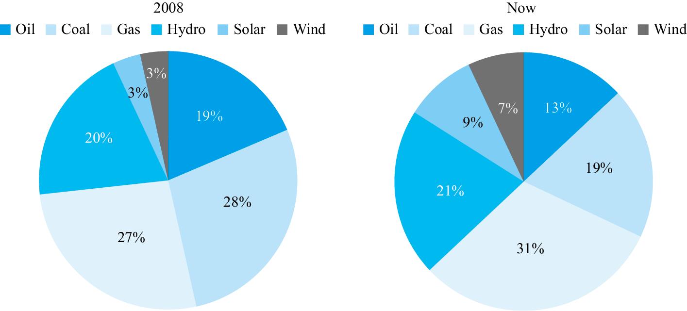
Energy production in a certain country in 2008 and today
The two charts give information about changes in the production of energy in one country. We can see that the proportion of energy produced by fossil fuels has declined, while that generated from renewable sources has increased.
Looking first at the figures for 2008, it is clear that almost three-quarters of the country's energy needs were met by burning three fossil fuels, oil, coal and gas. These provided 19%, 28% and 27% of the requirement respectively. 26% of power generation was from renewable sources of energy, hydro, solar and wind power, which provided 20%, 3% and 3% of the energy required respectively. Therefore we can see that the percentage of power generated by renewables was just over a quarter, while just under 75% was produced by fossil fuels.
However, the situation today has changed markedly. The proportion of power generation from renewable energy has risen sharply from 26% overall to 37%. Although there has only been a slight increase in power supplied from hydroelectricity, from 20 to 21%, the amount generated by solar and wind power has more than doubled from 3% for both sources to 9% and 7% respectively. Amongst fossil fuels, the amount of power generated by gas has increased slightly from 27% to 31%, while that provided by burning oil has declined by 6%. The most significant decline has been that of coal, which fell by 9%, from 28% to 19%.
当你写关于这个话题的文章时,可以使用这些短语 ! Include these phrases when writing essays about this topic!
Generated from renewable sources 由可再生资源产生
Changed markedly 显著的变化
Most significant decline 最显著的下降
Task 1 Chart 6
Summarise the information shown by selecting and reporting the main features. Make comparisons where relevant.
You should spend around 20 minutes on this task. You should write at least 150 words
通过选择和报告主要特征来总结显示的信息。在相关的地方进行比较。
你应该花 20 分钟来完成这项任务。至少 150 字。
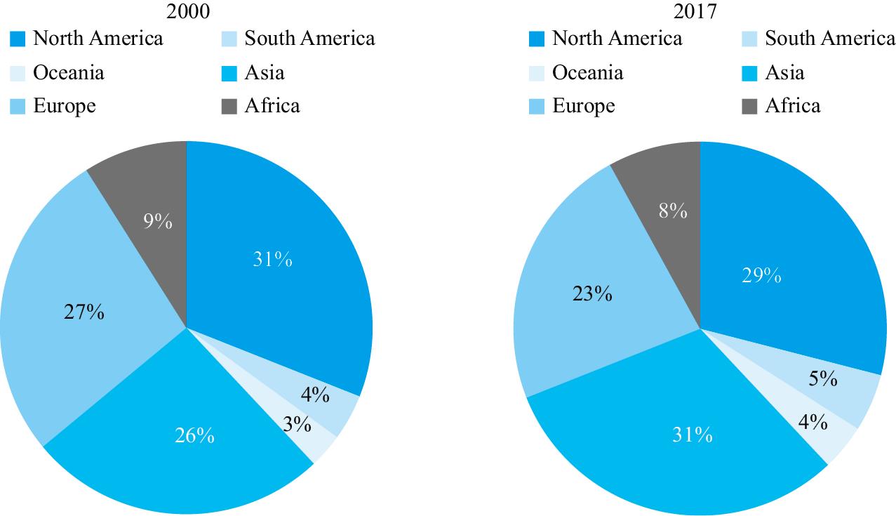
Destination of exports from EU countries to six continents in 2000 and 2017
The two charts show where exports went from the EU in two years, 2000 and 2017. It is clear that, although there were some changes over the period, there was a high level of consistency overall, with few substantial differences between the two dates.
Looking first at continents to which exports declined, we can see that the amount of goods sent to North America remained roughly stable, at 31% in the year 2000, decreasing marginally to 29% in 2017. A similar picture can be seen in relation to exports to Africa, which declined from 9% to 8%. Trade within Europe also fell slightly, from 27% to 23% over the 17 years.
Moving onto increases, we can see that these were also relatively small. The largest increase in exports was to Asia, where these increased by 5% from 26% in 2000 to 31% in 2017. Smaller rises took place in relation to Oceania and South America. Exports to these continents both rose by 1%, from 3% to 4%, and by 4% to 5% respectively.
当你写关于这个话题的文章时,可以使用这些短语 ! Include these phrases when writing essays about this topic!
High level of consistency 高度一致性
Remained roughly stable 基本保持稳定
Decreasing marginally 略微减少
Task 1 Chart 7
Summarise the information shown by selecting and reporting the main features. Make comparisons where relevant.
You should spend around 20 minutes on this task. You should write at least 150 words
通过选择和报告主要特征来总结显示的信息。在相关的地方进行比较。
你应该花 20 分钟来完成这项任务。至少 150 字。
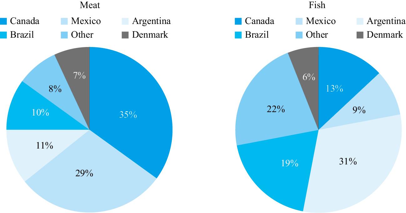
Meat and fish imports to the USA from selected countries
★ Essay correction
Read the essay below and correct the mistakes in bold . Then compare it with the notes and the corrected essay.
阅读下面的文章并纠正粗体处的错误。然后将它与注释和修改后的文章进行比较。
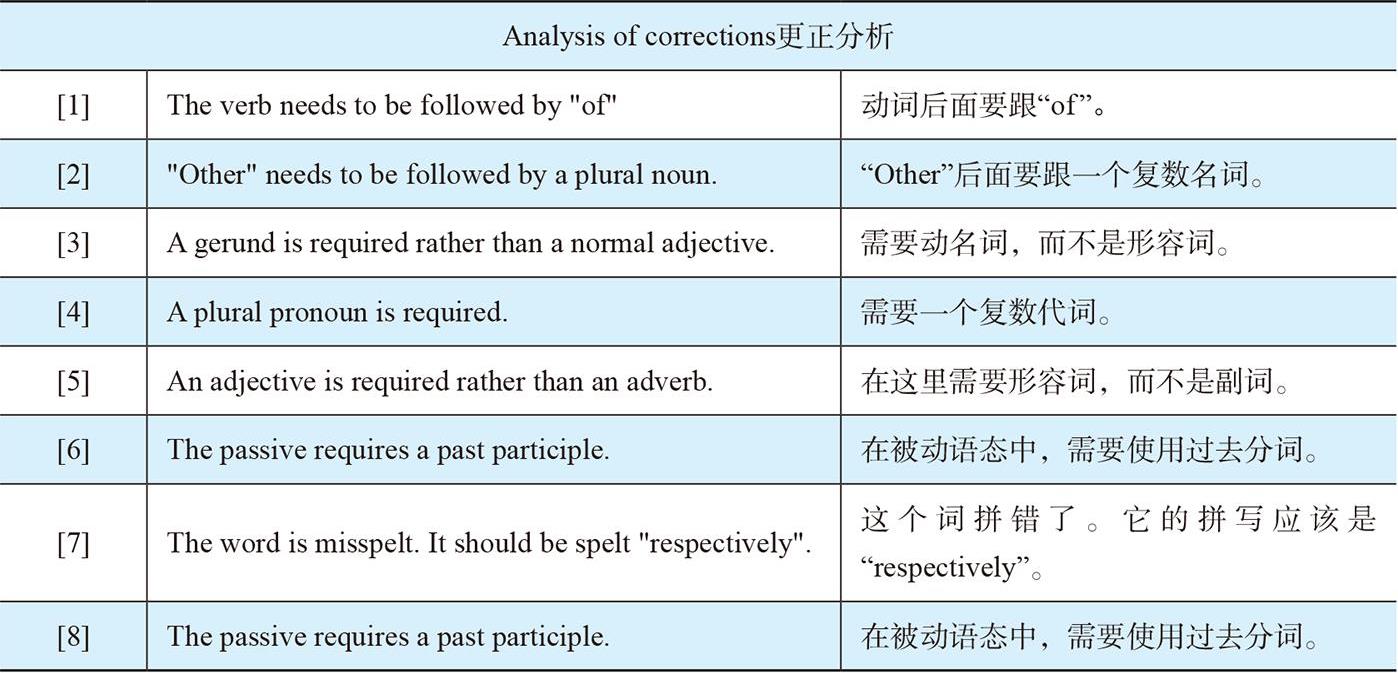
The two charts give details of imports meat [1] and fish from five countries to the USA, and the percentage of imports from other non-specified source [2] . We can see that there are widely various [3] figures for these products, in particular, those relating to the major importing countries for both meat and fish.
Looking first at meat imports, we can see that this [4] are dominated by two countries, Canada, which supplies 35% of the US requirement, and Mexico, at 29%. The other three countries specifically [5] on the chart, Argentina, Brazil and Denmark, supply around a quarter of the total, at 11%, 10% and 7% respectively. 8% of imports are from other countries.
Turning now to the importation of fish, again we can see that three countries supply around two-thirds of the requirement. 31% is import [6] from Argentina, 19% from Brazil and 13% from Canada. Denmark and Mexico supply 6% and 9% respectfully [7] . A major difference can be seen in sources from other countries, which supply 22%, almost 3 times the figure for meat.
In most cases, there are dramatic differences between the two sets of suppliers. Mexico supplies 20% less fish than meat, whereas for Argentina the figure is reverse [8] , supplying 20% more of the fish requirements. Brazil supplies almost double the percentage of US fish requirements compared to those for meat.
The two charts give details of imports of meat and fish from five countries to the USA, and the percentage of imports from other non-specified sources . We can see that there are widely varying figures for these products, in particular, those relating to the major importing countries for both meat and fish.
Looking first at meat imports, we can see that these are dominated by two countries, Canada, which supplies 35% of the US requirement, and Mexico, at 29%. The other three countries specified on the chart, Argentina, Brazil and Denmark, supply around a quarter of the total, at 11%, 10% and 7% respectively. 8% of imports are from other countries.
Turning now to the importation of fish, again we can see that three countries supply around two-thirds of the requirement. 31% is imported from Argentina, 19% from Brazil and 13% from Canada. Denmark and Mexico supply 6% and 9% respectively . A major difference can be seen in sources from other countries, which supply 22%, almost 3 times the figure for meat.
In most cases, there are dramatic differences between the two sets of suppliers. Mexico supplies 20% less fish than meat, whereas for Argentina the figure is reversed , supplying 20% more of the fish requirements. Brazil supplies almost double the percentage of US fish needs compared to those of meat.
当你写关于这个话题的文章时,可以使用这些短语 ! Include these phrases when writing essays about this topic!
Non-specified sources 非特定的来源
Imports are dominated by two countries 进口由两个国家主导
Importation of fish 进口的鱼
Dramatic differences between 有着巨大的差异
Summarise the information shown by selecting and reporting the main features. Make comparisons where relevant.
You should spend around 20 minutes on this task. You should write at least 150 words.
通过选择和报告主要特征来总结显示的信息。在相关的地方进行比较。
你应该花 20 分钟来完成这项任务。至少 150 字。
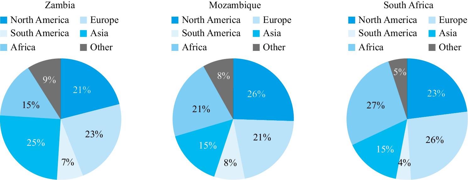
Destination of exports from three African countries in 2018.

Scan the QR Code for the Model Answer
扫码下载练习文答案